Think Like a Designer: Understanding Tone
Understanding tone is one of those simple interior design principles that can completely change the way you make selections for your home. Once you know what you're looking for, you'll start to see it everywhere.
You might not realise it - but tone can be the reason you are drawn to certain homes or spaces. After reading, take a look at your own Pinterest boards, what connections can you see between the tones of the images saved?
It's also one of the first things we consider when developing the material palette for a home, because getting the tones right from the beginning creates a foundation that makes every selection that follows feel much easier.
First, what do we mean by tone?
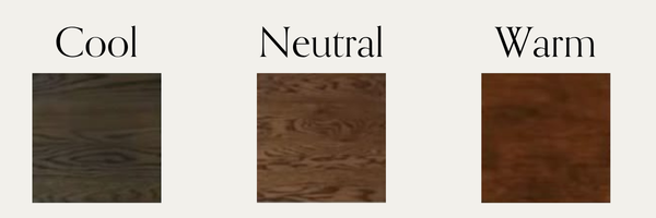
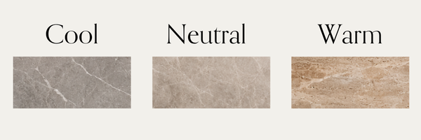
When we're talking about tone, we're looking beyond the obvious colour of a material and considering whether its underlying tone feels cool, neutral or warm.
A white isn't simply a white. A timber isn't simply a timber. And two beautiful stones can feel completely different depending on the tones running through them.
As a general guide:
Cool tones have cooler undertones and can lean towards grey, blue or cooler whites.
Neutral tones sit somewhere in the middle. They don't pull noticeably warm or cool and can act as a bridge between the two.
Warm tones have warmer undertones and can lean towards cream, beige, caramel, brown and earthy colours.
There isn’t one that’s better than the other, or one we use over the other. It's about deciding which direction your home is going in and then leaning into that.
The five surfaces we look at first
When we're establishing the tone of a home, we start by looking at five of the most dominant surfaces: flooring, walls, stone, cabinetry, tiles.
These finishes make up such a large proportion of what you see that they naturally establish the overall feeling of the home.
This is where moodboarding becomes so crucial. This is a process that we teach inside our Style + Moodboard Masterclass. Identifying the tones in your inspiration, in your samples, and training your eye so when you see samples together or in the showroom you know what works and what doesn’t. Samples that look completely fine individually can suddenly feel wrong when you physically place them alongside one another.
Before getting distracted by tapware, pendant lights, furniture or styling pieces, step back and look at these five surfaces together.
The point isn’t to match
This doesn't mean every material needs to be exactly the same tone. In fact, we don't want everything to match. We want to create layers- this is what creates variation and depth.
The important part is that the tones feel like they belong in the same conversation.
Neutral creates that middle ground. It allows you to layer different materials and finishes without the palette feeling disconnected.
A tonal story across the whole home
It is so important to look at the home as a WHOLE, not at rooms individually. When we identify the tone we want to use for our home, we want to maintain tonal relationship throughout the home.
If your kitchen is predominantly neutral to warm, carrying that tonal direction into your bathrooms and laundry helps the entire home feel connected, even when the individual finishes change.
When we create our moodboard for the home, we look at the materials and surfaces through the whole home and also separately room-by-room.
This is particularly important in open-plan homes, where you can often see several materials and spaces at once.
Want to learn more?
We cover tone and more in our Style + Moodboard Masterclass.
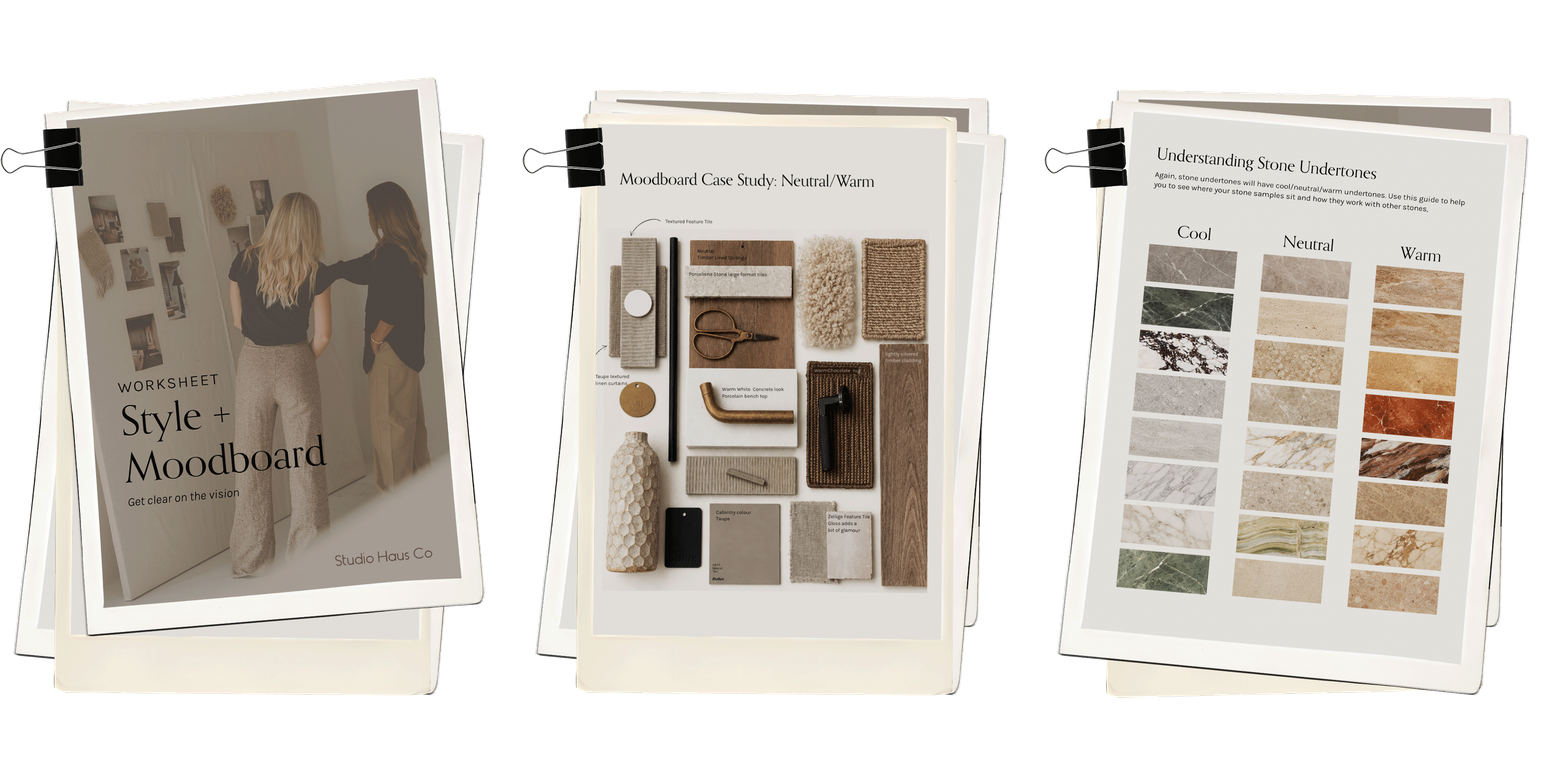
Style + Moodboard Masterclass
Our Style + Moodboard Masterclass. Your first step to gaining clarity, a clear vision and a defined moodboard. A 6-part video series with detailed worksheet & guide.
✓ How do you want your home to feel?
✓ Refining your vision, finding clarity
✓ Working with new builds + renovations
✓ Creating digital and physical moodboards
✓ Suppliers and samples